Grace Fellowship Church
Grace Fellowship Church (GFC) sought a visual identity that reflected their commitment to joyful worship, spiritual rest, and a strong culture of fellowship centered on unity in Christ.
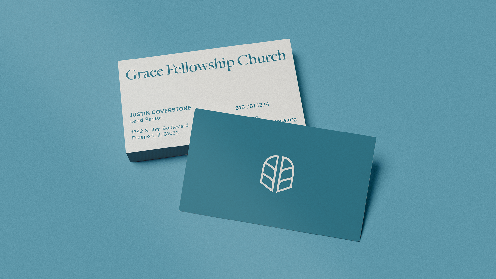
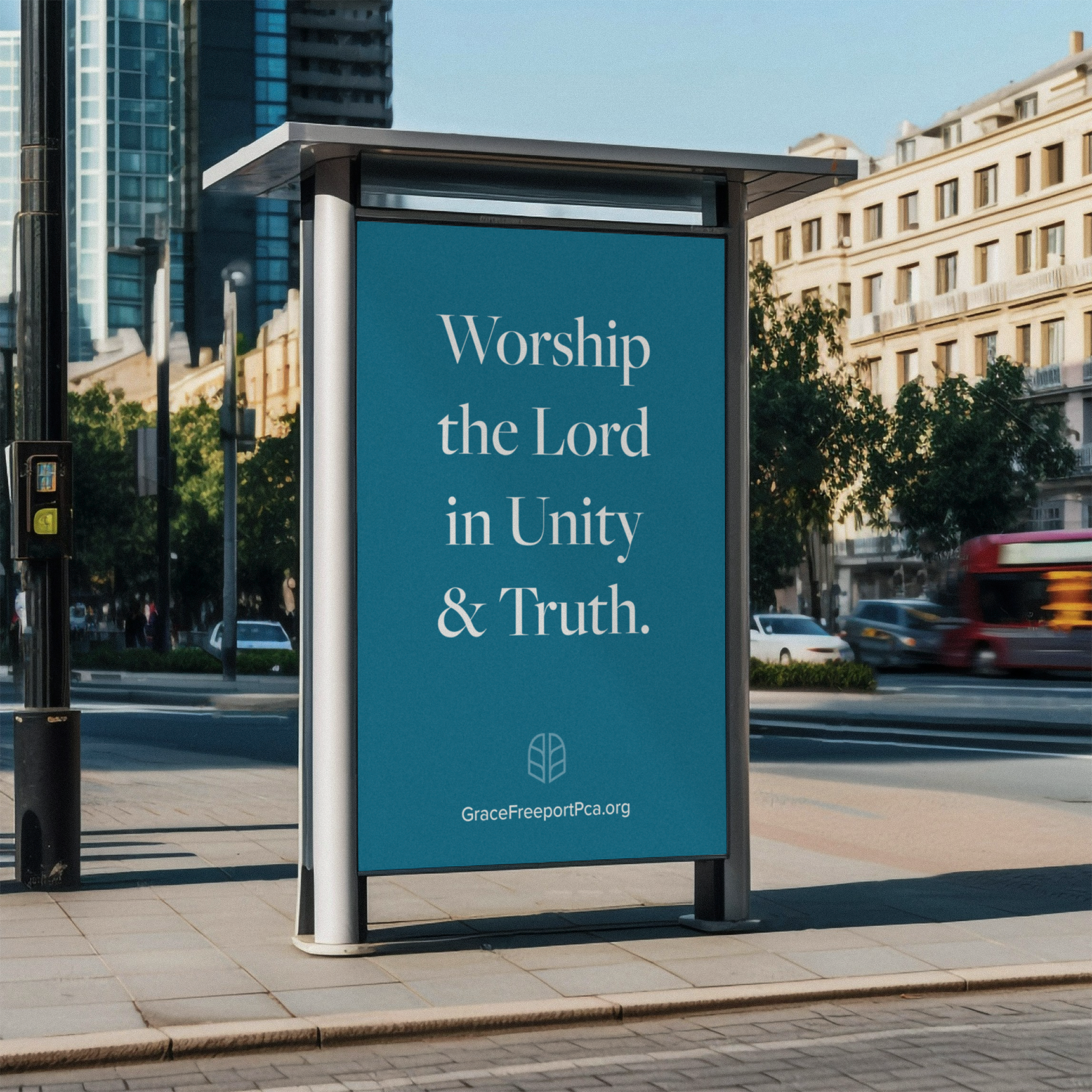
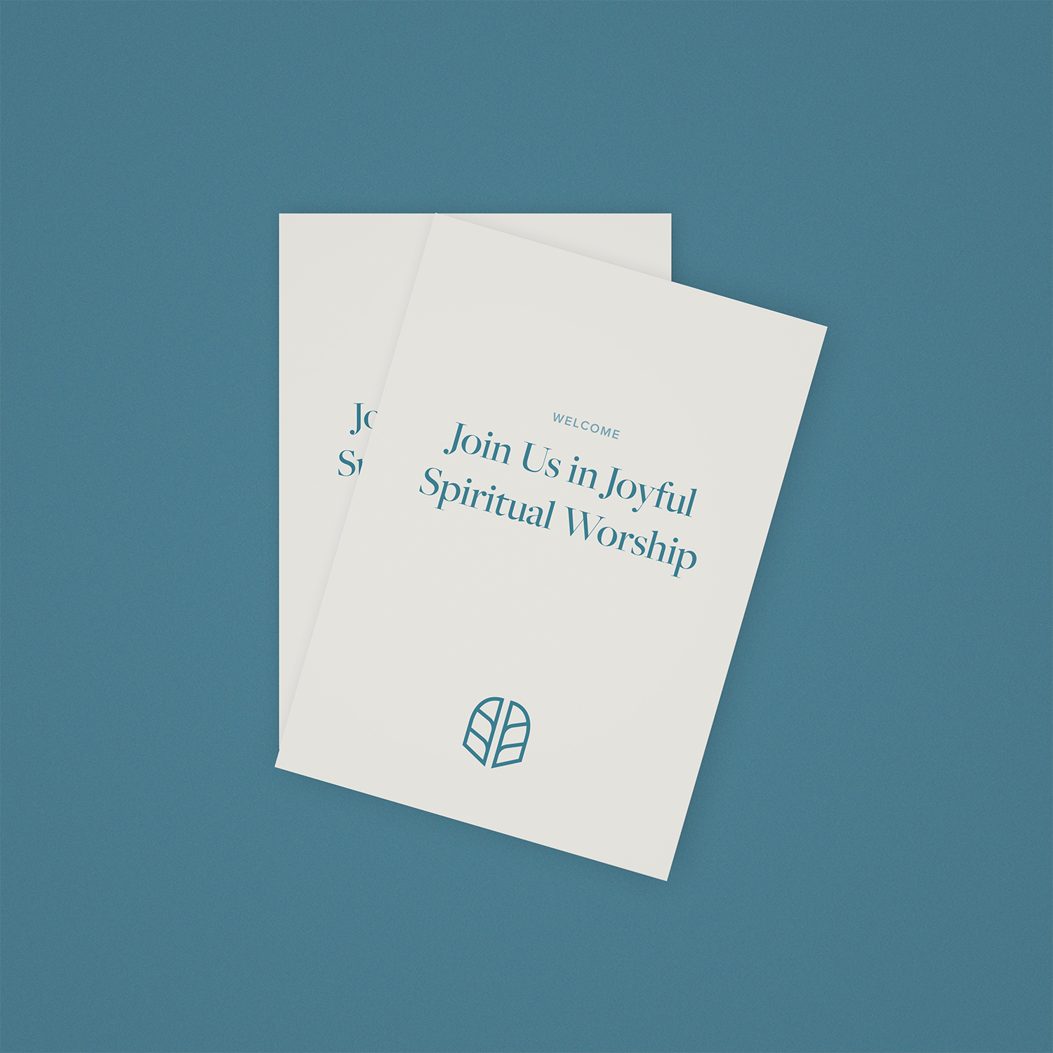
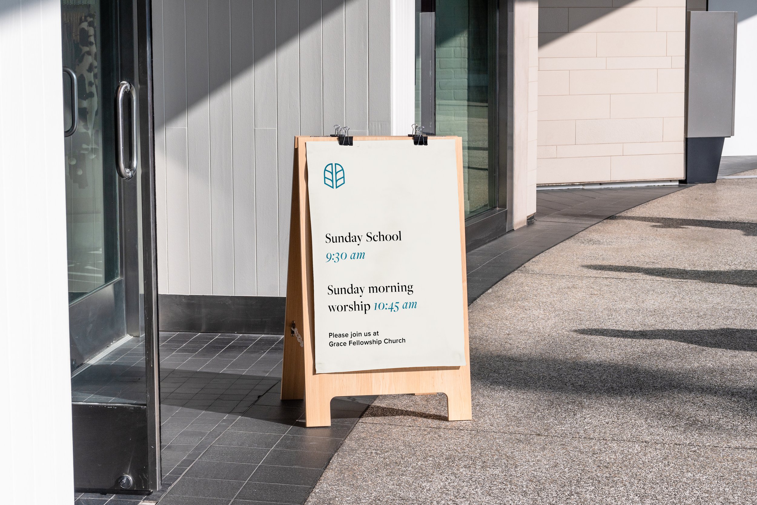
We refined their existing logo—preserving its meaning while rebuilding it for scalability, clarity, and long-term versatility. The updated mark was designed to function seamlessly across print, digital, and environmental applications.
The result is a unified identity that equips GFC to communicate its message more clearly.
The logo captures their emphasis on fellowship by depicting two open doors, meant to resemble a place welcoming to all who are broken. The upward-angled strokes within the doors convey a joyful posture in worshiping God with arms raised upward.